Stepcart Beta: New Default Theme

Warsaw, Poland, July 9, 2015 (Newswire.com) - Stepcart designed a new default theme for online stores. It’s everything there is to passion about eCommerce.
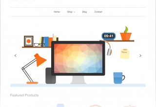
Home Page
A graphical designer totally redesigned the new home page by removing unnecessary elements of header, menu bar, features products and footer as well. We scribbled hundreds of sheets of paper with exquisite drawings, sketches, and doodles to create deceptively simple design.
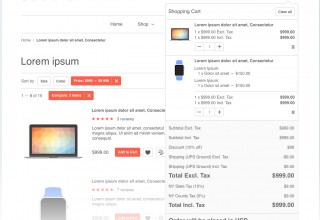
Category Page
The Stepcart team spent hours on the discussion of tones reviews and personal experience in eCommerce by finding the best way to display the products, filters, and options on the category page.
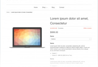
Product Page
Everything you need, and nothing more! It’s fun, it’s simple and it gives you a new way to sell your products or services.
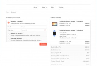
Checkout Page
By using our Magento experience in developing of one step checkout Stepcart team would like you to enjoy the checkout process by reducing it to simple steps allowing for increasing sales.
My Account Page
Each element inside the new my account page has been designed to get the most out of intuitively understandable and comfortable interface.
Take a look at one of our demo stores at http://demo.stepcart.com
You can find out more information at http://www.stepcart.com/blog/new-default-theme
