We can see that the US bond market, at over $40 trillion in value, is much larger than the US stock market, which comes in at a little over $25 trillion.
The “800-pound gorilla” in the investment world is not the US stock market, nor yet the gold market – it is the US treasury bond market.
The US bond market, at over $40 trillion in value, is much larger than the US stock market, which comes in at a little over $25 trillion. The longest-dated component of the US treasury market is the 30-year bond.
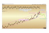
The chart below shows the price of the US 30-year bond from 1980 through the present. Readers should recall that interest rates move inversely to price – so as the price has been rising steadily for the past 36 years, interest rates have been falling this entire time, to a generational low of 2.1% last summer.
Image A
As we can see, investors have had an insatiable appetite for US debt over the past 36 years. We here see a market which was following a long-term orderly rising channel, which then started to take on characteristics of a mania from 2015 – 2016. During these recent years, bond prices began a parabolic curve higher (blue callout), corresponding to a willingness by investors to accept negative real returns for the privilege of holding US debt.
The textbook footprint of a mania on a chart is a long-term orderly market breaking higher into a parabolic curve. This is exactly what was witnessed from 2014 through mid-2016 in the longest-dated US bond.
Parabolic Curve Broken
The parabolic curve was then broken in last summer’s decline in bond prices, indicating a long-term top was put into place.
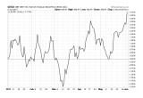
Yet bonds are once again in the media for having had several positive months in a row, as we can see below:
Image B
If our analysis is correct, any rally in bond prices from this point onward should be counter-trend in nature only. Last summer’s highs at 175 should not be regained for bond prices.
We will have strong confirmation within the next six months if bond prices make a new low below 145. Much stronger confirmation will come from a breakdown below the lower rising channel line (magenta color) near 135, which would be expected at any time within the next 12-36 months.
Bond Market Critical to US & Western Standard of Living
The one backdrop which most investors alive today have known is rising bond prices and the corresponding falling interest rates.
Let us assume that the average American begins to follow the financial markets and to consider investing at age 22. This means that anyone born after 1958 knows only falling interest rates as a broad macroeconomic backdrop.
Every political and technological advance that has happened in the US and allied western nations since 1980 has occurred amidst falling interest rates and ever-cheaper credit.
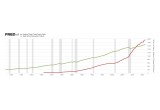
As a result, total debt in the United States exceeded gross domestic product for the first time in 2011, a trend which does not appear to be improving:
Image C
This imbalance can only happen amidst a backdrop of investors willing to ever finance US debt by continuously purchasing US-bonds.
Yet on the 36-year chart above, we show what appears to be the key characteristics of a market in the process of putting in a long-term top.
How will the United States finance this debt amidst a rising interest rate backdrop? The interest expense for federal debt alone in 2016 was $432 billion. Can we imagine if interest rates double just too historic norms that existed ten years ago? With the addition of record new debt this year, the annual interest rate expense alone could easily exceed $1 trillion within the next 3 years.
How will the United States fund an interest expense growing exponentially if the bond market has put in a long-term top?
Of course, no politician wins re-election in a democracy by cutting funding to constituents.
No one stays in office for long by cutting benefits to the sick, the elderly, the poor, veterans, schools, or for infrastructure.
And so, the solution to the funding gap is: the Federal Reserve will be forced to print money.
The central bank will be forced to create sufficient money to “monetize” US bonds to cover whatever cannot be raised by taxes alone.
Monetization of Debt is Inflation
Monetization is the direct creation of new money to finance debt – and it will represent a hidden tax on those least able to afford it, namely the poor and middle-class on fixed incomes.
When inflation drives up the prices of necessities such as food and shelter, these classes have no means to protect themselves, as they are forced to buy those items no matter the cost.
In contrast, those with disposable income can protect themselves and even benefit from periods of inflation if they invest properly by owning real assets. For this reason, inflation is a regressive tax, in that it steals quality of life from the poor and gives to the rich.
Such is the policy of most Western governments and central banks today.
Back to the Bond Market
Again, we come back to the bond market. The theoretical fundamentals of a declining bond market have been hypothesized by various writers for many decades… yet it is only now that we are seeing actual topping signals on the chart itself.
Is it possible that the parabolic curve seen on the chart above was simply a warmup for an even more manic final blow-off to come? Ultimately anything is possible in the markets.
But if that is going to happen, we will see it on the chart very soon, as bond prices should explode higher and clearly exceed the 175 level for 6-18 months before they come crashing down. Fundamentally, this could only correspond with real interest rates plunging into the negative 2-3% range, as investors would “pay” the government for the privilege of loaning money to them.
Our best assessment is that the top has already occurred. A parabolic curve in the largest bond market in the world that exceeded the 36-year rising channel has already broken down. It would be rare to see this curve regained again.
As gold and silver investors, this market bears our foremost attention over the next year. We should be able to plainly see a breakdown of the long-term rising channel on the chart when it occurs.
This will be a sign of a multi-decade top in no uncertain terms. Decades of rising interest rates should follow and amidst a backdrop of a government caught between a rock (unfunded debt) and a hard place (printing money), we know that in the fiat era a government will always choose the later.
The long-term thesis for protection by precious metals ownership is thus still in its infancy.
Christopher Aaron,
Bullion Exchanges Market Analyst
Christopher Aaron has been trading in the commodity and financial markets since the early 2000's. He began his career as an intelligence analyst for the Central Intelligence Agency, where he specialized in the creation and interpretation of the pattern of life mapping in Afghanistan and Iraq.
Technical analysis shares many similarities with mapping: both are based on the observations of repeating and imbedded patterns in human nature.
His strategy of blending behavioral and technical analysis has helped him and his clients to identify both long-term market cycles and short-term opportunities for profit.
Share:

